
Demand portfolio and volumes monitoring
Use the Demand view to understand how your demand volumes are evolving over time, how well they are covered by allocations, and slice the data by customer, tag, or any other dimension.
What is this about?
The Demand view gives you a live picture of all your contracted demand volumes (past and future) alongside their interim or final allocation status. This is your central place to answer two questions at any given time: how much demand do I have across my portfolios, and how much of it is covered by allocated green energy generation or EACs.
The view is useful for spotting allocation gaps, reviewing how coverage is distributed across customers or certificate types, and drilling into specific segments using filters and tags. Depending on how your portfolio is structured, demand in the platform comes from one of two sources, or both:
Option A: End consumer metering data
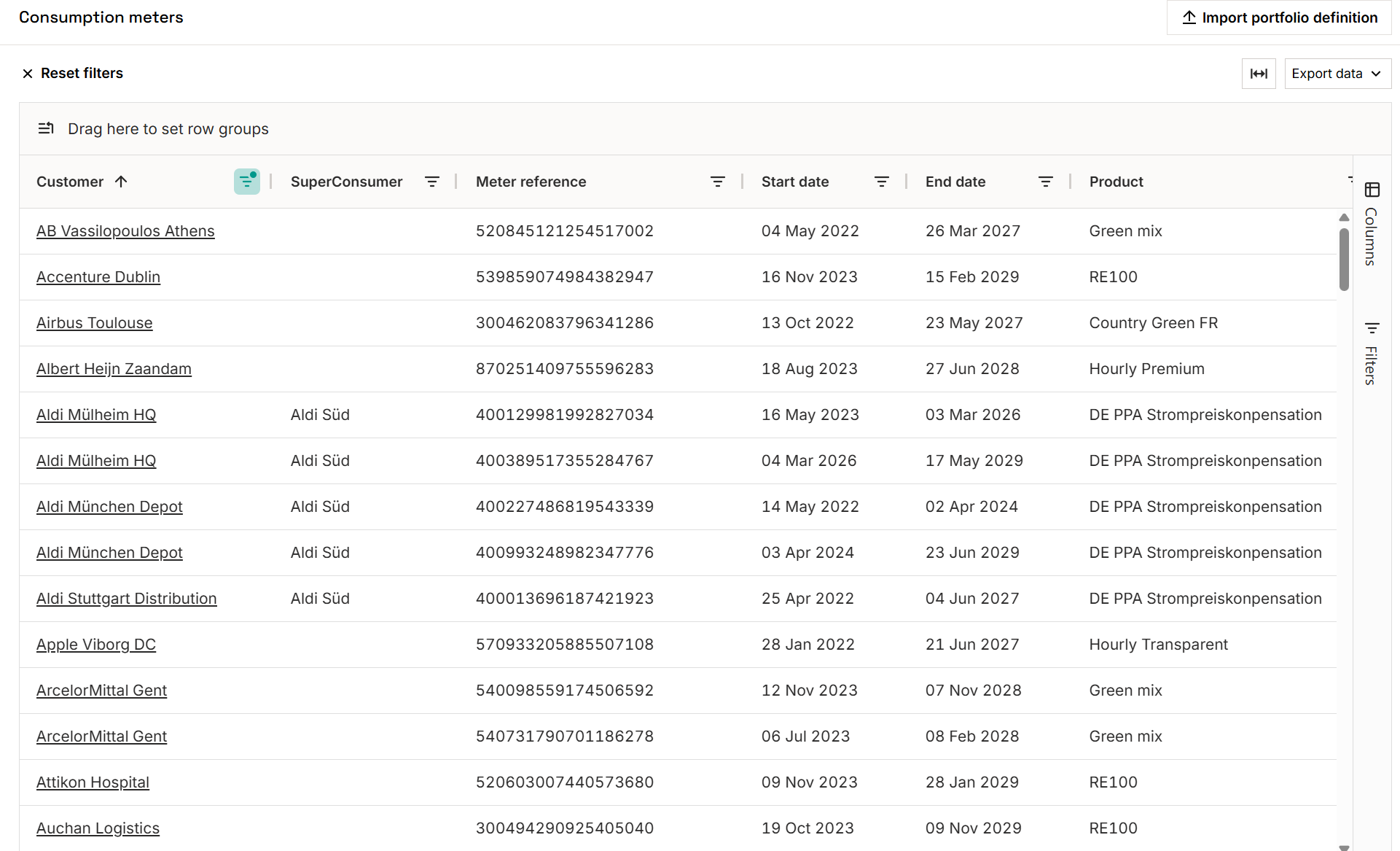
Each end consumer or consumption point is represented as a consumption meter in the platform, with its own unique device ID. Forecasted or actual consumption data is uploaded against this device ID, either via CSV or through the API.
Option B: Sell deals
If demand in your portfolio comes from contracted obligations to deliver certificates to a counterparty, these are captured as sell deals on the Deals page. Deals can be entered manually or ingested from an existing ETRM system.
How to monitor your demand portfolio
Option A: focus on end consumer metering data
Step 1. Capture your demand portfolio
Before you can monitor demand volumes, your demand structure needs to be reflected in the platform. For a full walkthrough of how to set up your demand structure and portfolio definition, see the related article: Model your demand portfolio into the platform
Step 2. Navigate to the Demand view (focus on: end consumer metering data)
In the left-hand navigation under Dashboards, click Demand view to explore your demand data. This includes both actual consumption already recorded and expected future demand from open contracts or forecasts.
Dashboard view
The dashboard gives you a visual overview of demand and EAC coverage for any selected period.
- Period selection: Choose the months of consumption or trade you want to assess. Use one of the presets (last year, current year, compliance year, etc.) or define a custom date range. Total demand appears as a blue line across the dashboard.
- Filters: Drill into the data by customer, portfolio, tariff, tag, technology type, or any other available category.
- Allocations: If generation volumes have been allocated for the selected period, they appear as filled histograms. Switch between matching resolutions (subhourly, monthly, or coarser) to analyse coverage in depth. Summary indicators and graphs update automatically.
- Allocation breakdown: View allocated volumes by technology, production device, or country of generation. Change the selection from the dropdown at the top right and the dashboard graphs and detailed breakdown below will update accordingly.
- Excess allocations: Generation volumes that exceeded demand at the time of allocation, based on the selected matching resolution, are shown separately as excess. This occurs when supply and demand are matched at a granular level and generation spikes above consumption within a given interval.
Example: Solar midday peak
A solar asset generating 800 MWh between 11 am and 1 pm is matched against a consumer with only 300 MWh of demand in that same window. At hourly resolution, the 500 MWh surplus cannot be carried forward and is recorded as excess allocation for that interval. Switching to a coarser resolution (monthly, for example) would absorb that surplus across the broader period, reducing excess but also lowering matching granularity.
- Carbon emissions: Automatically calculated for the selected period. Read more in this article.
- Graph customisation: ****Adjust the plotting resolution, switch between units (kWh, MWh, GWh, TWh), and export data as CSV or PNG directly from the dashboard.

The matching resolution affects how matching scores are calculated. Monthly resolution will typically show higher matching than hourly, since surpluses in one hour can compensate for shortfalls in another at coarser granularity. To understand when you can explore data on an annual, monthly, weekly, daily or (sub)hourly resolution, please read the article on Understanding annual, monthly, and hourly matching resolutions
Custom table view
The custom table view works like a pivot table and is fully configurable.
- Column selection: Choose the fields you want to display and filter down by customer, period, technology, allocation type, and more to build the exact view you need.
- Saved views: Create and save custom views for routine analysis or reporting exports, so you can return to the same configuration without rebuilding it each time

Option B: focus on sell deals
Monitoring sales deals and EAC coverage
If your demand portfolio is built around contracted delivery obligations, the Demand view lets you track how each sales deal is progressing against its EAC allocation, giving you a live read on what has been sold, what is covered, and where gaps are opening up.
Reading your demand position
The top metrics give you an immediate snapshot of the selected period:
- Demand: ****total contracted volume across your sales deals
- Allocated: ****volume already matched with supply
- Unallocated: remaining demand with no supply allocated yet; this is your open short position
Use the Period filter to focus on a specific month or range. The temporal matching panel on the right breaks down allocated volume across time, and the matching resolution window gives an overview of your matching scores at different granularities, from subhourly to annual.
Identifying coverage gaps
To compare demand against supply at the portfolio level, go to Portfolio view → Position monitoring. This is where you spot net long or short positions across your book. For a deeper breakdown by certificate quality (technology, country of generation, and so on) use Portfolio view → Custom table views. See the related articles: Explore your existing future and past long & short positions by different EAC qualities, and Explore long & short positions by EAC quality.
Tracking position changes over time
Your demand position will shift as sell deals are updated or new deals are added. To stay on top of this:
- Note the current net position figure in Position monitoring or your Custom table view.
- After any deal update, return to the view and compare; a change in net position may signal you need to act, for example, by sourcing additional supply or adjusting allocations.
Tips & things to know
- The Demand view includes all demand engagements by default — including those already fully delivered. Use filters to exclude historical periods if you want to focus on open positions.
- Tags are configured per organisation — if you don't see the tags you expect, check with your Granular Energy team.
- To understand when you can explore data on an annual, monthly, weekly, daily or (sub)hourly resolution, please read the article on Understanding annual, monthly, and hourly matching resolutions
- To see the supply side of the portfolio and how supply volumes are allocated out, switch to the Supply view in the left nav.
- For a high-level long/short comparison, use Portfolio view > Position monitoring.
- For questions or support, reach out to support@granular-energy.com.