
Understanding our PDF reports in detail
This article explains what every number and section in the Granular Energy matching report and End Customer Dashboard means. If you want to learn how to generate reports or set up dashboards, please read the article on How to use the Reports and End Customer Dashboards features for your customers
What is this about?
When your customers receive a PDF matching report, they see a structured summary of how their electricity consumption was matched with renewable generation over a given period. The report and the dashboard show the same underlying data.
This article walks through every section and every number in the report, so your team (and your customers) will know exactly what each figure represents and how it is calculated.
Contact us if you want to receive an example of a full report.
The header
At the very top of the report, you will find four key numbers displayed as summary tiles:
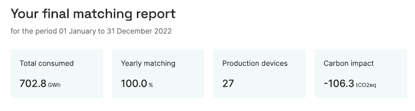
| Field | What it means |
|---|---|
| Total consumed | The total electricity consumption of this customer over the reporting period, measured in MWh or GWh. This comes from the metering data uploaded into the platform for this customer's consumption meter(s). |
| Hourly / Monthly / Yearly matching | The share of total consumption that was matched with renewable generation at the stated time resolution. For example, 83.7% hourly matching means that 83.7% of consumption hours were covered by renewable generation in the same hour. |
| Production devices | The number of distinct renewable generation assets whose certificates were allocated to this customer during the reporting period. |
| Carbon impact | The CO₂ saving achieved through the customer's renewable energy sourcing strategy, expressed in tonnes of CO₂ equivalent (tCO₂eq). This is the difference between what the customer's emissions would have been on the location-based grid average, and what they actually were under the market-based calculation. See the Carbon emissions article for the full methodology. |
Technology breakdown
This table shows how the matched renewable generation is split across different energy technologies (Wind, Solar, Hydro, Other), at each matching resolution.
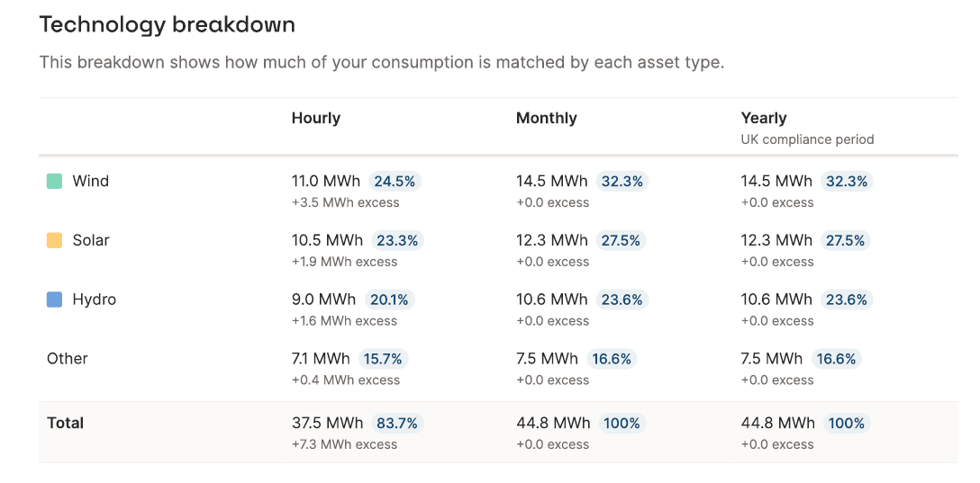
Matching resolutions
The table always shows multiple columns, one per matching resolution. Depending on the report configuration, these may be:
- Hourly: ****certificates are matched hour by hour. This is the most granular and the most meaningful from a temporal perspective.
- Monthly: certificates are matched within the same calendar month as consumption.
- Yearly / Yearly (UK compliance period): certificates are matched within the same year, either a calendar year (Jan–Dec) or the UK compliance year (April–March).
The numbers shown at each resolution are cumulative and inclusive: yearly matching includes everything that was matched monthly or hourly, and so on. This means the yearly matching percentage will always be equal to or higher than monthly, which will always be equal to or higher than hourly.
The numbers in each row
For each technology row, you see three values:
- Volume (MWh / GWh): the absolute volume of that technology's generation that was matched to this customer's consumption at this resolution.
- Percentage (%): this volume as a share of total consumption. The percentages across all technologies add up to the total matching percentage for that resolution.
- Excess: for higher granularities (such as hourly or monthly), you might end up with excess allocations. This happens if you, for example, 100% on an annual level of solar to a customer. Almost certainly, there will be more generation allocated at noon than consumption. The volumes of generation that exceed the consumption are described as excess volumes. These excess volumes can be matched under a lower granularity (for example, at a monthly matching level, the excess from noon can be used to cover nighttime consumption). The excess value in the table shows how much excess was allocated per technology. The volume + excess value on the hourly level will typically be equal to the total volume on the annual level.
Carbon content
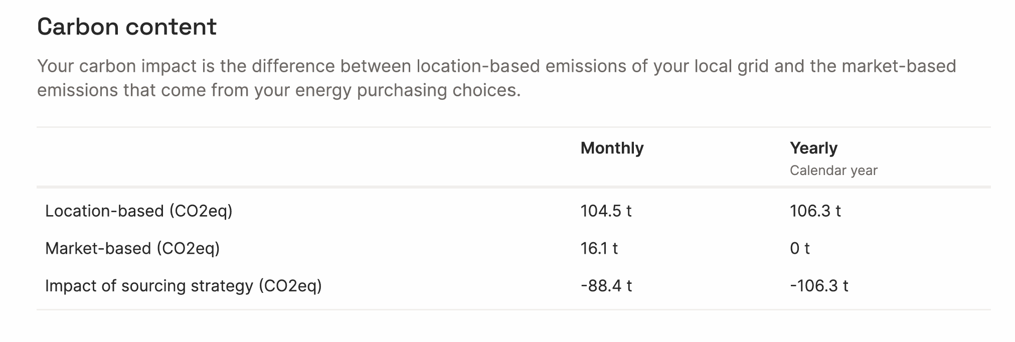
This section shows the customer's carbon emissions in three rows, at each matching resolution.
- Location-based (CO₂eq): The emissions attributed to this customer if they had simply consumed from the local grid, using the grid's average carbon intensity. This is a baseline — it does not reflect any renewable purchasing. See the Carbon emissions article for data sources and methodology.
- Market-based (CO₂eq): The emissions attributed to this customer after accounting for their renewable energy certificates. For volumes matched with zero-emission renewables, the emission factor is zero. For unmatched volumes, the residual mix emission factor applies. The better the matching score, the lower the market-based figure.
- Impact of sourcing strategy (CO₂eq): ****The difference between location-based and market-based emissions. This is the carbon saving the customer can attribute to their renewable energy purchasing. It is always shown as a negative number (a reduction). This figure feeds into the Carbon impact tile in the report header.
If you want to learn more about the carbon calculation, read the article on Carbon emissions
<aside>
Example: At yearly resolution with 100% matching, market-based emissions are 0 t, all consumption is covered by zero-emission certificates, so no residual mix applies. At hourly resolution with 83.7% matching, a residual mix factor applies to the unmatched 16.3%, so market-based emissions are 1.7 t rather than 0.
</aside>
Production device breakdown
This section shows the specific renewable generation assets whose certificates were allocated to this customer.
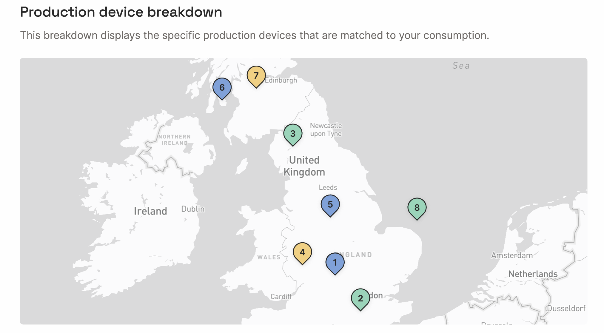
The map
The map shows the geographic location of each production device, numbered to match the table below. This gives the customer a transparent, visual view of where their renewable energy came from.
The table
Each row in the table represents one production device. For each device you see:
- Device name: the registered name of the generation asset.
- Technology: Wind, Solar, Hydro, or another technology type.
- Volume (MWh / GWh): the total volume of certificates from this device allocated to this customer during the reporting period.
- Percentage (%): this device's contribution as a share of the customer's total consumption.
- Excess: as with the technology breakdown, any excess certificates from this device are shown separately.
The top 8 devices are shown individually. All remaining devices are grouped under Other, which shows their combined volume and share. If you want to display more assets explicitly than the standard number, please get in touch with support@granular-energy.com
Matching over the report period (charts)
These charts show how matching scores evolved over time during the reporting period. Annual matching results will be included in all PDF reports; you can decide if you want to include the monthly or hourly details.
Matching representation in the time chart
The stacked bar chart shows, for each time period (month or year, depending on resolution), how much of the customer's consumption was covered by each technology, and how much remained unmatched. The blue line at the top of the bars represents total consumption. The coloured sections below represent the matched generation. Any gap between the stacked bars and the consumption line represents unmatched demand.
Average hourly matching chart (hourly reports only)
This chart shows the average matching profile across a typical day, broken down by hour (0–24). It reveals at which hours of the day the customer's consumption tends to be well-matched versus under-matched. For example, a customer with significant solar allocation may show strong matching during midday hours and lower matching at night, when solar generation is absent.
This view is particularly useful for customers who want to understand the time-of-day dimension of their renewable coverage. You can use this data to incentivise demand flexibility or the use of battery storage to shift generation to demand.
Cancelled certificates
The final section provides the full audit trail of the EACs (We use EAC - Energy Attribute Certificate - to describe all types of certificates, including GOs, iRECs, REGOs, HKN, etc.) that were cancelled on behalf of this customer.
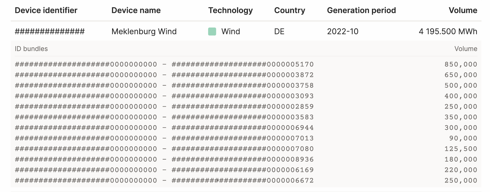
Each entry in the table shows:
| Column | What it means |
|---|---|
| Device identifier | The unique registry ID of the production device, as registered in the relevant national registry (e.g. Ofgem in Great Britain, RECS International in Europe). |
| Device name | The name of the production asset. |
| Technology | The generation technology (Wind, Solar, Hydro, etc.). |
| Country | The country in which the asset is located and in whose registry the certificates were issued (e.g. GB, DE). |
| Generation period | The month and year during which this energy was generated (e.g. 2023-10 = October 2023). Note that this may differ from the consumption period, certificates can be generated and cancelled in different months. |
| Volume | The total volume of certificates from this device cancelled for this customer, in MWh. |
ID bundles
Below each device entry, the individual certificate ID ranges are listed. Each row in the ID bundle table shows a range of certificate IDs and the volume those IDs represent. These are the specific serial numbers of the certificates in the relevant registry.
This level of detail allows the customer (or an auditor) to independently verify that the certificates exist in the registry and were genuinely cancelled. It is the foundation of the green energy claim's audit trail.
Certificate-level detail is included in Final reports only, not Interim reports. Final reports can only be issued once the cancellation statement from the registry has been reconciled with the platform allocations.
Interim vs. Final reports
The report header identifies whether this is a Final or Interim report.
- Interim report: Shows the current state of allocations in the platform. The underlying certificates may not yet have been cancelled in the registry. Figures can still change.
- Final report: The certificates have been cancelled in the registry and reconciled with the platform. The figures are locked and cannot be altered. This is the version suitable for sustainability reporting and regulatory submissions.
Tips & things to know
- The dashboard shows the same data as the PDF, updated live whenever allocations change. Customers with dashboard access can always see the latest picture without waiting for a new report to be generated.
- Matching resolution affects the carbon figures: a customer with 100% yearly matching but only 83.7% hourly matching will show 0 t market-based emissions in the yearly column, but non-zero in the hourly column. The yearly figure is what matters for most compliance frameworks today, but hourly is increasingly relevant for advanced sustainability disclosures.
- The "Other" row in the device breakdown: if a customer has many small allocations, most will appear under "Other". The full certificate-level detail is always available in the cancelled certificates table at the back of the report.
- For questions about the carbon calculation methodology (including how location-based and market-based emissions are calculated, data sources used, and the treatment of biomass) please refer to the Carbon emissions article.
- To learn how to generate reports or set up End Customer Dashboards, refer to the How to use the Reports and End Customer Dashboards features for your customers article.